The Basics of Book Typesetting
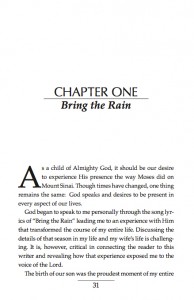
Reading is a skill we learn and practice daily. What most readers don’t consider, though, is the work that went into formatting the books they read every day. Over the coming weeks, I’d like to provide some brief pointers for those who are interested in typesetting a book. Unlike most other forms of design, a book that looks unique and artistic is often unprofessional, and usually hard to read. Your goal should be to create an eye catching cover, chapter titles and running headers, while keeping the main text simple and easy to read.
Essential Elements to Consider at the Start
The following are some of the basics that need to be considered before you embark on your project. I will be discussing these elements, and more, in my upcoming posts.
- Trim Size (The final size of a printed page after excess edges have been cut off is the trim size. Crop marks indicating where to cut are printed at the edges of the paper that are then trimmed after printing.)
- Margin Size
- Which Fonts you will use (I would recommend using only 2-3 fonts in a book).
- You’ll need a program such as InDesign/Quark, etc. (I would strongly discourage using Word, there are VERY powerful shortcuts that can be utilized by using InDesign and Quark, or other similar Typesetting Software)
Let’s Talk Fonts
Serif vs Sans-Serif
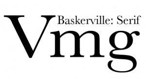
 Serif fonts should always be used for the main body of text because they are spaced equally between each letter, sans-serif fonts are spaced differently between each letter. This changes the overall “color” of the page text. When working with long documents this will ultimately make the text as a whole strange to look at and difficult to read. Sans-Serif fonts should be reserved for titles and headlines only. People don’t read letter by letter so sans-serif fonts should not be used in books. Palatino and Baskerville are among my favorite fonts among the standards. I’ve included a list of some of the standard fonts used:
Standard Serif Fonts (for main text):
- Palatino Linotype
- Baskerville
- Book Antiqua
- Georgia
- Goudy Old Style
- Bookman
- Century Schoolbook
- Adobe Garamond Pro
- Bembo
- Janson
- Times New Roman (used more for Newspaper)
Font Sizes (Source)
A common mistake is to choose large fonts because they’re “easier to read”. That might be true – but, fonts that are too large look like a children’s book, and in the long run, your eyes actually have to move more, and turn more pages!
Fonts that are too small are difficult to read for anyone, but especially for older people or people who don’t read much.
Do not go smaller than 8pt for a serif font.
Do not go smaller than 10pt for a sans-serif font.
Compact-width fonts, e.g., Times Roman, look best in 11 or 12 points.
Wider fonts, e.g., Palatino, look best in a smaller font size, usually 10 or 11 points.
“Large print” books are at least 14 points.
Mono-spaced Fonts Never Use Mono-spaced fonts for a book (beware, they have serifs). Each letter has the same spacing, period. Look at the image, the “iii” is the same space as “mmm”, but because it is a vertical letter, you eyes see lots of negative space, where the mmm are very close together and hard to read.
Low-Resolution Fonts (Source)
These fonts include New York, Geneva, Monaco, and Chicago. These were designed to look good at the low 80 dpi resolution of the original Macintosh and its Image Writer printer. Modern printers are at least 360 dpi. Don’t use these fonts unless you’re trying to make your document have that authentic 1984 birthplace-of-desktop-publishing look.
 Unusual Fonts
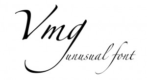
Use unusual fonts only for short items, e.g., the title and author’s name on the cover, or for chapter titles.
That’s more than enough for today – but stay tuned, there is more to come!

