Welcome back! Last time I was talking about the basics of book typesetting and layout. Here’s some more basics for anyone starting out. As always, feel free to ask questions.
Margins (Source)
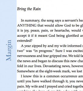
- For bound books 6″x9″ or smaller, use 0.5″ margins on the top, outside and bottom of books, and a 0.75″ inside margin.
- For 8.5″x11″ documents (bound or unbound), use 1-inch margins.
- Adjust margins, font size, and columns to produce 65-70 characters per line (including spaces).
Printers often require a minimum of 1/2 inch margins. Narrower margins risk smearing wet ink as the printing press’s rollers move the paper.
Justify Text?
YES! It is the standard for a book. Make sure that you justify your text, however, be careful not to leave “open lines”, or large spaces between words because of the justified text. This looks very unprofessional. Using Ragged Right text is another option which can be used for certain instances, quoting text, narrow columns. Around graphics, you may need to look at the text and choose which one works best.
Leading (Source)
 Leading (which is pronounced “led”, as in: “he led you to the store”) is the space in between lines of text. It’s also called spacing, as in single-spaced, double-spaced, etc.
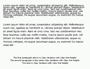
Fonts and leading are referred to as two numbers. E.g., “12/13” or “12 on 13 points” is a 12-point font with 13 points of leading.
Single-spaced can be the same as the font size (called solid), e.g., a 12-point font on 12-point leading. Or it can be the font size plus one point, e.g., a 12-point font on 13 points of leading is single-spaced. Check what your word processor does.
A 12-point font with one-and-a-half spacing is 18 points of leading, or 12/18.
Indenting Paragraphs
Paragraphs should be indented slightly. There should be no space between indented paragraphs. The indentation should not be a “tab”, it should be a small indent. (Look many books to see the standards)
Header (Running Header) (Source)
 To a typesetter, a header means a chapter or section title. What your word processor calls a header is called a running header by a typesetter.
Page numbers should at the outer margin of the running header. Use a font family distinctive from the text font family, e.g., Helvetica for the running header if your text is Times Roman. Also use a font size distinctive from the text font size, e.g., 10 points for the page number, if the text is 12 points.
The Chicago Manual of Style (1.94) advocates not putting the book title in the verso (left hand) running header. They reason that your readers don’t need to be reminded what book they’re reading. However, if a reader photocopies your book and the title is in the left hand header the title will show on each copy.
Chapter Header
The first page of each chapter should not have a running header.
Emphasising words
Simply put, you should use simple italics to emphasize words. These should all be avoided unless you want to express something very specific like “YELLING”: Capital letters, bold (this will change the “color” of the whole page, underlining (people will try to click it thinking it’s a link in their mind), or large letters if that can be helped. Simple is best.
Double Spacing after ending a Sentence
I’ll keep this simple. Don’t do it. Double spacing is a thing of the past and is no longer the standard. For a more in-depth history, check Wikipedia. If you have a document that is double spaced, do a simple “find/replace” and replace ” ” with ” ” for a quick fix.
Thanks for checking in!

